On this page

A spurious correlation is a statistical association between two variables that shows no direct causal link between them, yet still measures as strong and significant. It is one of the most repeatable failure modes in applied machine learning: models trained on these associations perform well on paper and fail hard the moment the underlying pattern shifts. Watch for it first in high-dimensional feature sets, in trending time series, and in samples that were filtered before you ever saw them.
- High-dimensional data (hundreds of candidate features invite chance associations)
- Time series with shared trends (both series rising over time, unrelated mechanism)
- Filtered or selected samples (the filter itself creates the pattern)
At a conventional significance threshold, roughly 1 in 20 unrelated variable pairs will look significant by chance, and that ratio gets worse fast once you’re scanning hundreds of columns.
Pro Tip: Before you trust any correlation a model surfaced on its own, ask what mining process produced it. If a feature importance score or a screening algorithm generated the candidate, treat it as a hypothesis, not a finding.
Key Takeaways
Spurious correlations create confidently wrong models because statistical association alone never verifies the causal mechanism a model implicitly relies on.
| Point | Details |
|---|---|
| Mechanism first, not magnitude | A high correlation coefficient never confirms causation; identify confounding, selection bias, trending, or chance before trusting it. |
| Time series need stationarity checks | Run ADF and cointegration tests before trusting correlation between two trending series. |
| OOD validation catches most damage | Test any promising feature on genuinely new data before it reaches production. |
| Toolkits won’t catch this for you | Standard ML libraries report association, not mechanism, so engineer-driven causal checks are required. |
| Study real incidents, not just theory | Glitchive’s case library documents verified failures caused by spurious signals, along with the fixes applied. |
Table of Contents
- What Is a Spurious Correlation, With Real Examples
- Why Do Spurious Correlations Happen? Six Mechanisms
- How to Detect a Spurious Correlation Before You Trust It
- How Spurious Correlations Break Production Models
- Mitigation: Reducing Reliance on Spurious Signals
- A Runbook for Investigating a Suspicious Correlation
- Why This Failure Mode Keeps Recurring
- Find Documented Cases of Models Fooled by False Signals
- Sources
- FAQ
What Is a Spurious Correlation, With Real Examples
Correlation is not causation, but the sharper practitioner point is that spuriousness is a claim about mechanism, not about magnitude. A correlation coefficient of 0.95 can be just as spurious as one of 0.3. What matters is whether a plausible causal pathway connects the two variables, or whether something else, coincidence, a shared trend, a hidden third factor, is doing the work.
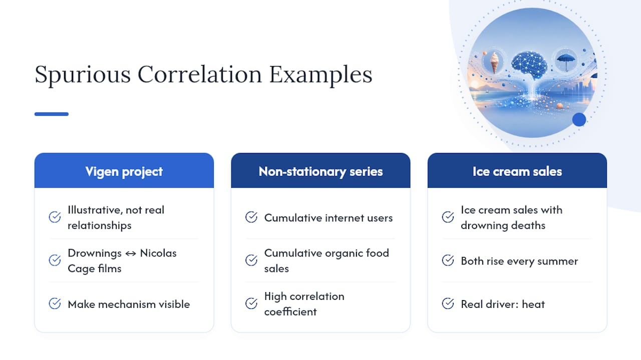
The internet’s favorite illustration of this comes from Tyler Vigen’s Spurious Correlations project, which mines public datasets and plots pairs like “number of people who drowned by falling into a swimming pool” against “number of films Nicolas Cage appeared in” that year. These are clearly illustrative, not real relationships, but they make the mechanism visible: scan enough series and some will move together by pure accident.
Time series create a more dangerous version of the same problem, because the coincidence looks like a trend, not a fluke. Two non-stationary series, say, cumulative internet users and cumulative organic food sales, will often show a high correlation coefficient purely because both are climbing over time, a pattern statisticians call spurious regression.
A textbook version pairs ice cream sales with drowning deaths: both rise every summer, and a naive analysis says ice cream causes drowning. The real driver is heat, which pushes people toward both ice cream stands and swimming pools, a confounder that the correlation itself never reveals.
An image worth having on hand for training decks: a scatterplot next to a two-panel time-series chart, one showing genuine causal covariation, one showing two unrelated trending lines that happen to overlap.
Why Do Spurious Correlations Happen? Six Mechanisms
Every spurious correlation traces back to one of a small number of mechanisms, and diagnosing which one is at work tells you exactly which fix applies.
- Confounding: a shared cause drives both variables (heat drives ice cream sales and swimming, not one driving the other).
- Selection and collider bias: the sample was filtered on a variable downstream of both factors, manufacturing a relationship that doesn’t exist in the general population.
- Measurement artifacts: shared instrumentation, rounding, or a common data-collection quirk creates correlated noise.
- Non-stationarity and trending: both series drift upward or downward over time for unrelated reasons, and ordinary correlation can’t tell drift from causation.
- Ecological aggregation (Simpson’s paradox): a relationship that holds at the group level reverses or vanishes once you look at individuals.
- Pure chance and multiple comparisons: test enough variable pairs and some will cross a significance threshold by luck alone.
Each of these mechanisms can produce a correlation coefficient that looks strong and a p-value that looks convincing, because the statistical test only measures co-movement, never mechanism. A high r with a low p-value tells you the pattern is unlikely to be noise in that sample; it says nothing about whether the pattern will hold in a new one, which is exactly where confounding, selection bias, and trending all hide.
Pro Tip: Start diagnosis with the data’s shape. If it’s a time series, check stationarity first. If it’s cross-sectional and came from a filtered or opt-in sample, suspect selection bias before anything else. Mechanism-first thinking saves you from running the wrong test.
How to Detect a Spurious Correlation Before You Trust It
A prioritized sequence beats an ad hoc gut check, and it should run in roughly this order:
- Sketch a causal DAG. Map every plausible confounder and collider between your two variables before running another test.
- Test stationarity and cointegration for any time-series pair. Run the Augmented Dickey-Fuller (ADF) test for unit roots, then Engle-Granger or Johansen cointegration tests if both series trend.
- Run out-of-distribution (OOD) validation. Check whether the association survives on a genuinely new sample, not just a held-out split from the same collection process.
- Check subgroup and stratified effects. Split by cohort, geography, or time period; a real effect should hold direction across most strata (Simpson’s paradox shows up here).
- Run permutation tests and correct for multiple comparisons. If you scanned many candidate variables, apply Benjamini-Hochberg or Bonferroni corrections before trusting any single p-value.
A practical diagnostic sequence ties these together: reproduce the finding in a holdout or OOD set, run residual diagnostics (autocorrelation in residuals signals a missing variable or an untreated trend), sketch the causal diagram, then attempt a targeted experiment or instrumental variable (IV) approach if the stakes justify it.
- ADF test flags whether a series has a unit root (non-stationary).
- Cointegration tests tell you whether two trending series share a genuine long-run equilibrium.
- Permutation tests build a null distribution empirically instead of assuming one.
Pro Tip: Run the cheapest test first. An OOD holdout check takes minutes and kills a large share of spurious findings before you invest in a DAG or a formal experiment.
How Spurious Correlations Break Production Models
Models don’t know the difference between a real signal and a spurious one; they optimize whatever reduces loss on the training distribution, which means a spurious feature that happens to correlate well gets baked in just as confidently as a genuine causal driver. That’s how you get a model that scores well in validation and then falls apart the moment the world shifts underneath it.
- Overfitting to spurious features: the model locks onto a pattern that won’t generalize, often a background artifact, a timestamp proxy, or a demographic correlate.
- Brittle generalization under distribution shift: performance holds until the population, season, or data source changes, then degrades sharply.
- Misleading feature importance: SHAP values or built-in importance scores rank a spurious feature highly simply because it correlated well in training.
- Reward hacking in downstream policies: a reinforcement-learning or ranking system exploits the spurious signal because it’s easier to optimize than the real target.
In production, the warning signs are a sudden drop in OOD metrics, a feature whose importance score swings wildly across retraining runs, and partial-dependence or SHAP curves that shift shape from one time window to the next. None of this gets flagged automatically. Standard ML toolkits report statistical association, not causal mechanism, so catching spuriousness is an engineer-driven test, not a default output of your pipeline.
Mitigation: Reducing Reliance on Spurious Signals
Reducing exposure to spurious correlations starts before modeling, in how the study or dataset gets built. Pre-register your hypotheses, hold out a genuinely confirmatory dataset you don’t touch during exploration, and replicate any promising finding in independent data. Skipping this step and quietly testing new hypotheses on the same data you used to generate them (HARKing) is how exploratory correlations get mistaken for confirmed findings.
Causal methods give you the strongest ground truth when you can afford them. Randomized controlled trials (RCTs) remain the gold standard for isolating a causal effect. Where randomization isn’t possible, instrumental variables, difference-in-differences designs, propensity score matching, and DAG-driven structural causal models let you adjust for confounders explicitly rather than hoping regression sorts it out.
On the engineering side:
- Audit new features for plausible causal pathways before adding them to a production model.
- Automate OOD detection and monitor for distribution drift continuously, not just at deployment.
- Score feature stability across retraining windows; a feature whose importance swings wildly is a spuriousness red flag.
- Apply regularization or maintain a guarded feature set that excludes known unstable proxies.
Immediate checklist: draw the DAG, run one stationarity or permutation test on the top candidate features, check subgroup consistency, and require an OOD confirmation before shipping any model built on a newly discovered correlation.
Pro Tip: Prioritize by impact and feasibility. A quick DAG sketch and an OOD test catch most of the damage; save instrumental variables and full causal inference pipelines for the associations that would actually change a shipping decision.
A Runbook for Investigating a Suspicious Correlation
When a correlation looks too clean to ignore, work the problem in order rather than jumping straight to a fix.
- Reproduce the finding on fresh data pulled independently from the original set.
- Draw the causal DAG, listing every plausible confounder and collider.
- Run stationarity checks (ADF) and a permutation test on the association itself.
- Check subgroup and OOD performance across at least two distinct cohorts or time windows.
- Attempt causal identification: a small experiment, a natural experiment, or an instrumental variable if one exists.
- Decide remediation: drop the feature, add an instrument, collect new data, or adjust explicitly for the confounder.
- When reporting upward, state what you tested and what remains uncertain; never claim causal proof from a correlation alone.
- Flag the finding’s confidence level explicitly (exploratory vs. confirmed) so downstream teams don’t overtrust it.
For engineers who want to see this pattern in the wild, Glitchive’s case library documents verified incidents where teams shipped on a correlation that later broke in production, along with the fix that followed.
Why This Failure Mode Keeps Recurring
Spurious correlations show up in incident postmortems again and again because they are cheap to find and expensive to unwind. This isn’t an academic curiosity; it causes outages, regulatory exposure, and real user harm once a model acts on it. Glitchive’s case library exists to document exactly these incidents.
Find Documented Cases of Models Fooled by False Signals
Reading about spurious correlations in the abstract only goes so far. Glitchive’s case library exists precisely because practitioners need documented, real incidents, not hypothetical ones, to recognize the pattern before it costs them a production outage. One entry worth studying: a support chatbot that invented a refund policy and left a company liable in front of a tribunal, a case where a plausible-looking pattern in training data led to confidently wrong output. Every case on Glitchive follows the same structure: the incident, the contributing factors, the technical analysis, and the fix that was actually applied. If your team is auditing a model for spurious dependencies right now, start at the Glitchive homepage and search the case library for failure patterns that match what you’re seeing.
Sources
- Spurious Correlation: Causes & Detection — CASRAI
- The Deluge of Spurious Correlations in Big Data (Calude et al.)
- Spurious relationship — Wikipedia
- What is Spurious Correlation? - Displayr
- Spurious correlation examples — Statology
FAQ
What is a spurious correlation in simple terms?
It’s a measurable relationship between two variables that has no real causal link between them; the numbers move together, but nothing connects them mechanistically.
What is an example of a spurious correlation?
Ice cream sales and drowning deaths both rise in summer, not because one causes the other but because hot weather drives both; Tyler Vigen’s project catalogs dozens more illustrative pairs like this.
What is meant by a spurious relationship?
It describes an association, often a strong one statistically, that is driven by a confounder, a shared trend, selection bias, or chance rather than by one variable causing the other.
Can a spurious correlation have a very high correlation coefficient?
Yes. A coefficient above 0.9 can still be entirely non-causal if it stems from a shared trend or an unaddressed confounder, which is why magnitude alone never confirms mechanism.
How is a spurious correlation different from confounding?
Confounding is one specific mechanism that produces a spurious correlation; other mechanisms, like selection bias, non-stationarity, and pure chance, produce the same misleading pattern through different routes.