On this page

The fastest way to evaluate data quality platforms is a 10-point scorecard that tests schema enforcement, lineage, completeness, validity, representativeness, drift detection, label quality, access controls, alert quality, and evidence export. Score each on a 0 to 10 scale during a live proof of concept, not a slide deck demo. Vendors that can’t produce row-level evidence for a failed check don’t belong in a regulated AI pipeline.
Run these checks before you sign anything:
- Schema enforcement on malformed and unexpected records
- Lineage from raw source to model input, with impact analysis
- Completeness thresholds by field, not just by table
- Validity rules tied to business logic, not generic regex
- Representativeness sampling against your production population
- Drift detection on both features and labels
- Label quality audits with inter-rater agreement or spot checks
- Role-based access controls and audit logging
- Alert precision and recall on seeded anomalies
- Evidence export in a format your auditors can actually use
The next step is a two to four week proof of concept, covered in detail below, that turns these ten checks into pass/fail evidence instead of vendor promises.
Key Takeaways
A reliable AI data pipeline depends on evaluating data quality platforms with a weighted 10-point scorecard validated through a hands-on proof of concept, not vendor claims alone.
| Point | Details |
|---|---|
| Use a weighted scorecard | Score ten dimensions, from schema enforcement to evidence export, with weights matched to your use case. |
| Run a real POC | Test claims over two to four weeks with seeded schema changes, drift injection, and malformed records. |
| Demand record-level evidence | Require exportable, audit-ready outputs, not aggregate dashboards with no drill-down. |
| Weight failure-prone areas higher | Prioritize lineage, drift, and label quality since these cause the highest AI model risk. |
| Study documented failures | Use Glitchive’s verified case studies to design realistic fault scenarios for your own POC testing. |
Table of Contents
- What Does Data Quality Mean for AI Systems?
- What Core Features Should a Data Quality Platform Have?
- How Do You Build a Scorecard to Compare Vendors?
- What Should a Proof-of-Concept Test Plan Look Like?
- Integration, Deployment, and Security Checklist
- Which Operational Signals Predict Long-Term Reliability?
- What Real AI Failures Teach You About Testing Priorities
- What Data Teams Get Wrong When Evaluating These Platforms
- Where Glitchive Fits Into Your Evaluation Process
- Sources
- FAQ
What Does Data Quality Mean for AI Systems?
Data quality for AI is fitness for use, judged against the specific consumer of the data. That distinction matters more than it sounds. A dataset that’s perfectly clean for a quarterly sales report can still poison a model if it under-represents a subset of users or carries mislabeled training examples nobody caught. Some platforms now score data “readiness” per consumer (analytics, regulatory, AI training) rather than issuing one blanket quality grade, which is closer to how model risk actually behaves, according to DQLabs.
Eight dimensions matter for AI specifically:
- Completeness: are required fields populated at the rate your model needs?
- Accuracy: does the value match reality, not just a valid format?
- Consistency: does the same entity look the same across systems?
- Timeliness: is the data fresh enough for the decision it feeds?
- Uniqueness: are duplicate records inflating or skewing training sets?
- Validity: does the value conform to defined business rules?
- Representativeness: does the sample reflect the population the model will see in production?
- Label quality: are the ground-truth labels correct and consistently applied?
| Dimension | Platform capability you should demand |
|---|---|
| Completeness | Field-level profiling with null-rate trends over time |
| Accuracy | Cross-source reconciliation and outlier detection |
| Consistency | Entity matching and standardization rules |
| Timeliness | Freshness monitoring tied to pipeline SLAs |
| Uniqueness | Deduplication with record-level match scores |
| Validity | Rule engine with versioned, auditable rule sets |
| Representativeness | Statistical sampling and population drift comparison |
| Label quality | Label distribution audits and annotator agreement metrics |
What Core Features Should a Data Quality Platform Have?
Every serious platform needs seven capability areas, and you should push past the marketing slide for each one.
Profiling and continuous monitoring should produce more than a one-time report. Ask for a live dashboard that tracks null rates, cardinality, and distribution shape over weeks, not a snapshot from the sales demo. IBM’s watsonx.data intelligence pairs automated profiling with AI-driven scoring specifically so this monitoring runs continuously across hybrid environments instead of on a schedule someone forgets to rerun.
Rule engines and data contracts need versioning and propagation. When a rule changes, does it flow to every downstream pipeline automatically, or does someone have to manually redeploy? IBM’s documentation on data contracts frames this as governing quality at the source rather than patching it downstream, which is the right mental model for AI pipelines where a silent schema change upstream can quietly corrupt a training set.
Matching and deduplication should give you record-level diagnostics, not just a deduplicated count. You need to see why two records were merged.
Lineage and impact analysis should trace both directions: which upstream source caused a quality failure, and which downstream models or reports consumed the bad data before it was caught.
Record-level observability and evidence export is where most platforms separate. Some tools produce deterministic, row-keyed issue reports that map directly to specific rules, which matters when an auditor asks “show me the failing rows,” according to CureData.
Automation and AI features like rule discovery and anomaly detection sound great until you ask for the false positive rate. Demand an explainability trail for every automated flag.
Connectors and deployment determine whether the platform runs queries in place inside your warehouse or pulls data out to its own compute, which changes your egress costs and latency profile.
Pro Tip: Ask every vendor to run their anomaly detection on a dataset you seed with known errors. If they can’t tell you the false positive rate on your own test, they can’t tell you in production either.
How Do You Build a Scorecard to Compare Vendors?
A 10-point scorecard only works if the weights match what actually breaks AI pipelines. Weight lineage, drift, and label quality higher than cosmetic dashboard polish.
Score each item 0 to 10. A 0 to 2 means the vendor couldn’t produce evidence at all. A 3 to 5 means they showed a feature but no real output. A 6 to 8 means they produced usable evidence with minor gaps. A 9 to 10 means the evidence was audit-ready, exportable, and explainable without a vendor engineer translating it for you.
Pro Tip: Calibrate the weights to your use case before the demo, not after. A model-training team should weight representativeness and label quality higher; a regulatory reporting team should weight validity and evidence export higher.
What Should a Proof-of-Concept Test Plan Look Like?
A focused proof of concept beats a long pilot. Two to four weeks is enough time to generate real scorecard evidence if you structure it tightly.
- Week 1: Onboarding and baseline profiling. Connect the platform to a representative slice of production data, not a cleaned sample. Get a baseline profile report.
- Week 2: Active fault injection. Introduce a schema change, seed duplicate records, inject malformed values, and shift a feature’s distribution intentionally. Watch what the platform catches and how fast.
- Week 3: Remediation loop. Route a flagged issue through the platform’s ticketing or ownership workflow and time how long it takes a human to resolve it.
- Week 4: Evidence export verification. Pull the audit trail for every test above and check it against your compliance team’s actual documentation requirements.
Track time-to-detect for each seeded fault, the false positive rate on legitimate data, and whether the exported evidence would survive an actual audit. If the platform flags every minor variance as critical, your team will tune out the alerts within a month, which defeats the purpose of buying the tool.
Keep the dataset size realistic: large enough to trigger true scalability behavior, small enough that the POC doesn’t become a six-month integration project.
Pro Tip: Run the drift injection test twice, a week apart. A platform that catches it the first time but misses the second is measuring novelty, not drift.
Integration, Deployment, and Security Checklist
Non-functional requirements decide total cost of ownership more than the feature list does.
- Confirm connector depth: does it support incremental profiling, or does every run rescan the full table?
- Clarify the execution model. In-place SQL execution against your warehouse avoids egress costs; push-to-warehouse or dedicated-compute models add latency and data-movement risk.
- Ask for scalability numbers in tables per second and rows per second at your actual data volume, not a marketing benchmark.
- Verify data residency options, encryption at rest and in transit, and granular role-based access control.
- Confirm audit log completeness: can you export every access event for a compliance review?
Cloud deployment usually wins on elastic scaling but raises data residency questions for regulated industries. On-premises deployment solves residency but shifts the scalability burden onto your own infrastructure team. Hybrid models split the difference and are becoming the default choice for organizations that need both speed and compliance control.
Which Operational Signals Predict Long-Term Reliability?
The demo tells you what a platform can do. Production tells you what it will do at 2 a.m. when a pipeline breaks.
- Ask for the alert precision rate: what percentage of flagged issues turn out to be real problems, versus noise the team learns to ignore?
- Confirm the remediation workflow: does a flagged issue create a ticket with the failing records attached, or just a generic notification?
- Get explicit SLA numbers for support response time and escalation paths during a production incident, not just business-hours coverage.
- Check whether governance integrations support role-based approval for data contract changes, so one engineer can’t silently loosen a validation rule.
A platform that can’t explain why it flagged a record, or produce the specific rows behind that flag, isn’t observability. It’s a black box with a dashboard bolted on. Any team that has had to reconstruct an incident after the fact knows the difference between a tool that hands you evidence and one that hands you a summary.
Watch for red flags: AI-driven anomaly detection with no explainability trail, dashboards that show aggregate scores but no record-level drill-down, or a vendor that can’t answer what happens when their own rule engine produces a false positive at scale.
What Real AI Failures Teach You About Testing Priorities
Documented AI incidents point to a short list of failure modes that deserve the highest scorecard weight: schema drift that silently changes a field’s meaning, missing fields that get backfilled with defaults nobody flagged, label contamination from inconsistent annotation guidelines, and distribution shift that degrades a model’s accuracy without triggering any alert.
| Failure mode | POC test | Success signal |
|---|---|---|
| Schema drift | Introduce a field type change mid-run | Alert fires within one pipeline cycle |
| Missing fields | Seed nulls in a required field | Completeness alert triggers below threshold |
| Label contamination | Sample and re-audit a labeled batch | Agreement rate reported with discrepancy list |
| Silent distribution shift | Inject a feature-distribution change | Drift alert with statistical evidence, not just a flag |

A short incident runbook helps here: when a check fails, first confirm it’s not a false positive by checking the raw record. Second, assign ownership based on the lineage trace, not by guessing which team touched the data last. Third, decide rollback versus fix-in-place based on how many downstream consumers already ingested the bad batch. A documented case of a coding agent wiping a production database during a code freeze shows why that rollback decision needs to happen in minutes, not hours.
Pro Tip: Weight your scorecard toward whichever failure mode has hurt you before. A team that already survived a labeling incident should push label quality audits to the top of the list, regardless of what a generic template recommends.
What Data Teams Get Wrong When Evaluating These Platforms
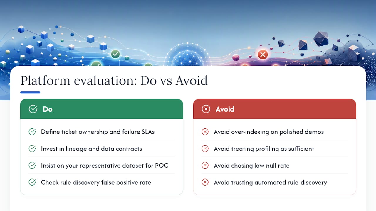
Most teams over-index on the demo and under-index on the boring stuff: who owns the ticket when a check fails, and whether the data contract actually matches the SLA the model team signed up for.
Quick wins like profiling and basic rule checks are worth doing in week one, but they don’t substitute for the harder investment: lineage and contracts that let you trace a bad prediction back to its root cause. Teams that skip that step end up debugging model failures by guesswork months later.
The most common pitfall isn’t a bad platform. It’s measuring the wrong metric, chasing a low null-rate while ignoring representativeness, or trusting an automated rule-discovery feature without checking its false positive rate against real production noise. Over-automating without a human reviewing edge cases tends to bite teams exactly when the stakes are highest: a regulatory audit or a model rollout.
Negotiate POC scope before you sign anything. Vendors will offer a curated dataset unless you insist on your own messy, representative slice.
Where Glitchive Fits Into Your Evaluation Process
Every scorecard item in this guide gets sharper when you test against a failure that actually happened, not a hypothetical one. Glitchive is a searchable library of verified AI failure case studies, each one documenting the incident, the root cause, and the specific fix applied, which gives you realistic fault patterns to seed into your own proof of concept instead of guessing what might break.
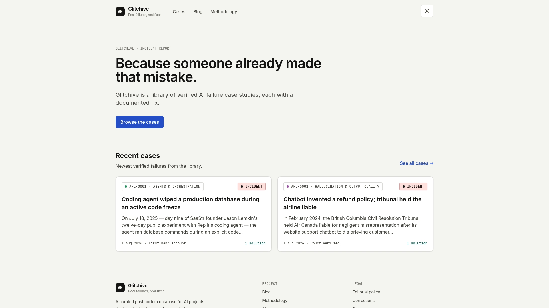
The case study on a support chatbot that invented a refund policy is a useful example: it shows exactly the kind of validation gap a data quality platform should catch before it reaches production. Every case on Glitchive follows a documented verification methodology, so you’re working from confirmed incidents rather than anecdotes. Browse the full case archive to pull scenarios relevant to your industry, then use them to design POC tests that mirror failures your vendor evaluation might otherwise miss.
Sources
FAQ
What Are the Core Dimensions of Data Quality?
Completeness, accuracy, consistency, timeliness, uniqueness, and validity form the widely cited core set, and AI-specific evaluations add representativeness and label quality since model risk depends on both.
What Types of Data Quality Platforms Exist?
They range from open-source cleaning tools like OpenRefine for one-off fixes, to enterprise platforms with continuous monitoring and lineage, to AI-native tools that score data readiness per consumer, such as analytics, regulatory, or model training.
Is There a Single Best Platform for Data Analysis?
No single platform wins every use case; the right choice depends on your deployment model, connector needs, and whether you’re optimizing for analytics dashboards, regulatory evidence, or AI model training.
What Should I Look for During a Vendor Demo?
Ask for record-level evidence exports, false positive rates on seeded anomalies, and a live trace showing lineage from a raw source to a specific model input, not a polished dashboard screenshot.
How Long Should a Proof of Concept Take?
Two to four weeks is enough to run fault injection tests, verify remediation workflows, and check whether exported evidence would hold up in an actual audit.